MOW
Administrator  Owner/Operator
Currently: Offline
Posts: 5,821 
Location:
Joined: September 2003
Retired: USAF, Civil Service
|
Post by MOW on Sept 3, 2012 16:12:05 GMT 9
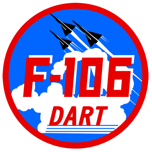
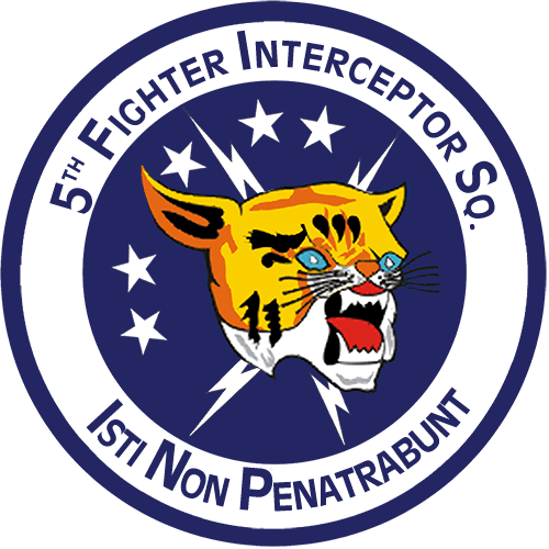
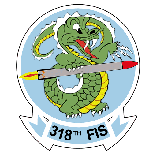
I'm back to thinking about a commemorative coin to represent the website and our forum. This what I've thrown together as a first draft for one side. I want to get your feedback on this: good, bad, changes, additions, removals anything would be appreciated. I want to do it as a 2" gold plated coin to have the same type look as Pat P's 456 FIS coin and maybe have the backside the F-106 patch like the 318th coin... maybe, I like the ADC side of the 456th coin too, plus it shows off the gold well www.f-106deltadart.com/photo_gallery/index.php/F-106-Patches/Challenge-CoinsAnyway, looking for design feedback from the group. ![]() www.f-106deltadart.com/images/f-106deltadart.com_coin_S2 www.f-106deltadart.com/images/f-106deltadart.com_coin_S2 old.jpg[/img] |
|
|
|
Post by lugnuts55 on Sept 3, 2012 22:51:18 GMT 9
MOW, I love these coins and I am happy that there will be one available for this web site. I looked at the proposals you suggested and I personally like the ADC logo. I like the words saying, "When you're out of Sixes, you're out of interceptors". I don't know if it's appropriate to say Department of the Air Force. I think those words around the ADC logo would look good and also say what we believe without stepping on anybody's toes.
I like the side you show and have the above comments for the other side. :2thumbsup :salute
|
|
|
|
Post by pat perry on Sept 4, 2012 0:04:21 GMT 9
Wow!
I like side 1 the way it's shown
For side 2 I'd recommend the ADC emblem with
USAF Air Defense Command around the top
and
"When you're out of Sixes, you're out of interceptors" around the bottom.
Just my 2 cents,
Let's hear some more ideas...
Pat P.
MOW, do you design these using PhotoShop?
|
|
Jim Scanlon (deceased)
Senior Staff  FORUM CHAPLAIN
Commander South Texas outpost of the County Sligo Squadron
FORUM CHAPLAIN
Commander South Texas outpost of the County Sligo Squadron
Currently: Offline
Posts: 5,075
Location:
Joined: July 2007
Retired: USAF
NBA: Spurs
NFL: Niners
MLB: Giants
NHL: Penguins
|
Post by Jim Scanlon (deceased) on Sept 4, 2012 0:13:52 GMT 9
MOW
I think the design you have come up with is great.
I wouldn't change a thing on it.
The Obverse would be good with the ADC logo.
I also like the way the words are around the edge of the 456th coin.
I don't think anything more needs to be on it, unless you can figure out where to put "Defenders of SAC".
Jim Too
:god_bless_usa
|
|
|
|
Post by Jim on Sept 4, 2012 1:03:17 GMT 9
Wow! I like side 1 the way it's shown For side 2 I'd recommend the ADC emblem with USAF Air Defense Command around the top and "When you're out of Sixes, you're out of interceptors" around the bottom. Just my 2 cents, Let's hear some more ideas... Pat P. MOW, do you design these using PhotoShop? not AEROSPACE will order some for use on reunion clocks..... You want clocks for your reunion?  ?? Ask me- they are FREE!!!!!!!!!!! And Pat perry has paid the shipping... I've offered in the past- no takers... Done offering...... Exception- Anyone here thinks that someone should have one for participation here on the forum, PM me and we will talk about it...... Some one want to run a contest here on the forum- I'll donate a couple of clocks and you can run the contest. I did 2 of them...... The Old Sarge |
|
Jim Scanlon (deceased)
Senior Staff
FORUM CHAPLAIN
Commander South Texas outpost of the County Sligo Squadron
Currently: Offline
Posts: 5,075
Location:
Joined: July 2007
Retired: USAF
NBA: Spurs
NFL: Niners
MLB: Giants
NHL: Penguins
|
Post by Jim Scanlon (deceased) on Sept 4, 2012 3:12:34 GMT 9
I'm changing my feeble mind on the back slogan.
"When you're out of Sixes, you're out of interceptors". is perfect.
How about all capitol letters for SIXES and INTERCEPTORS?
If it doesn't say Air Defense Command, don't bother.
That other name is not what most of us served under.
Just my two Baht.
Jim Too
:god_bless_usa
|
|
|
|
Post by shadowgunner on Sept 4, 2012 8:19:03 GMT 9
:2thumbsup I like it!
|
|
Jim Scanlon (deceased)
Senior Staff
FORUM CHAPLAIN
Commander South Texas outpost of the County Sligo Squadron
Currently: Offline
Posts: 5,075
Location:
Joined: July 2007
Retired: USAF
NBA: Spurs
NFL: Niners
MLB: Giants
NHL: Penguins
|
Post by Jim Scanlon (deceased) on Sept 4, 2012 8:21:54 GMT 9
:2thumbsup
I like it.
I like it.
When?
How much?
Jim Too
:god_bless_usa
|
|
|
|
Post by Jim on Sept 4, 2012 8:25:44 GMT 9
 I like it. I like it. When? How much? Jim Too  me too Put me down for 100.00 worth and an address for the check and it will be in the mail....... |
|
|
|
Post by Diamondback on Sept 4, 2012 10:26:45 GMT 9
Nice! I'd be looking at 3 if budget allows...
|
|
|
|
Post by pat perry on Sept 4, 2012 10:32:43 GMT 9
I made a change as you'll see in the graphic in the above post. I changed the word FORUMS to read WEBSITE & FORUM trying to draw the attention to both sites, although they are interconnected they are separate. Thoughts? Good idea on the website & forum. You might even be able to drop the http:// but it does already balance well in the graphic Is there room to add 1525.93 MPH or 1526 MPH or Mach 2.31 before the (Sep 2012) line? Just thinking out loud. However it ends up, sign me up for $100 worth. Pat P. |
|
MOW
Administrator
Owner/Operator
Currently: Offline
Posts: 5,821
Location:
Joined: September 2003
Retired: USAF, Civil Service
|
Post by MOW on Sept 4, 2012 10:36:52 GMT 9
I made a change as you'll see in the graphic in the above post. I changed the word FORUMS to read WEBSITE & FORUM trying to draw the attention to both sites, although they are interconnected they are separate. Thoughts? Good idea on the website & forum. You might even be able to drop the http:// but it does already balance well in the graphic Is there room to add 1525.93 MPH or 1526 MPH or Mach 2.31 before the (Sep 2012) line? Just thinking out loud. However it ends up, sign me up for $100 worth. Pat P. Yes, I thought about the http:// as well, but decided to leave it to draw attention to it. But, to standardize, I suppose both the .com's should be the same one way or another. Let me look at this some more. I wanted to add 1525.93 MPH as well. Let me look at that more also. Great feed back all, thanks. |
|
|
|
Post by pat perry on Sept 4, 2012 11:03:36 GMT 9
Ok, how about those changes? MOW, I think you've :  it. Don't be bashful... let's hear from the rest of you. Pat P. |
|
MOW
Administrator
Owner/Operator
Currently: Offline
Posts: 5,821
Location:
Joined: September 2003
Retired: USAF, Civil Service
|
Post by MOW on Sept 4, 2012 11:37:54 GMT 9
OK, a couple other areas for feedback needed:
1. I like the larger 2" coin as it displays details better, For those who have seen the 456th, 318th or 62nd coins up close I think you will agree. But the 2" coin costs a bit more to produce.
2. I like the gold plating over the bronze. It is bright and shiny and gives off that immediate WOW factor.
Those 2 things drive the cost up, but even with that I think I can procure these at a cost that would allow them to still go for $7-8 each. I won't know until I go show them the design and deal with them, but based on history, I think that would be in the ballpark.
Thoughts?
|
|
Jim Scanlon (deceased)
Senior Staff
FORUM CHAPLAIN
Commander South Texas outpost of the County Sligo Squadron
Currently: Offline
Posts: 5,075
Location:
Joined: July 2007
Retired: USAF
NBA: Spurs
NFL: Niners
MLB: Giants
NHL: Penguins
|
Post by Jim Scanlon (deceased) on Sept 4, 2012 11:38:51 GMT 9
I noticed the address is on the coin two times.
One above the Six and one on the lower edge.
Should one be enough?
Jim Too
:god_bless_usa
|
|
|
|
Post by pat perry on Sept 4, 2012 13:02:01 GMT 9
I noticed the address is on the coin two times. One above the Six and one on the lower edge. Should one be enough? Jim Too No, they're different. One is to the website: www.f-106deltadart.comOne is to this forum: forum.f-106deltadart.comShould I not list the forum URL and just rely on the primary page? While getting to the forum is linked on every page of the website, it is a separate URL/site, but I could do that, just list the web site only. I'd leave both URL's on the coin since they represent the two major portals into Pat's World. Enter either one of them and it's like drinking through a fire hose because there's a lot of STUFF there. But, we may be back to the problem of needing a home (or welcome) page that's real simple and doesn't get "busy"until you get inside the area you are looking for. An indication of this is when you go to the Guest Book page and visitors ask questions. I often wonder if they ever come back looking for answers. I have looked for their email address to send them a reply but can't find one unless they left one in the text of their guest book entry. Usually, if they get "bold" enough to try out the forum we have a good welcoming committee to answer their questions and give them URLs to go to within these sites. Most of us who visit here often are looking for the fastest way to get to what we want and have found it through trial and error. Example: finding an existing thread you know you've seen before is a major pain in the a$$ using the search feature. It's doable but takes a lot of time (seconds/minutes) so the fastest way is to create a new thread that often winds up being in the wrong topic. See, just like I have hijacked this thread to start a new thought I have set a bad example. So let me kick the can down the road on this until we start a thread on it. Pat P. :rofl |
|
Deleted
Currently: Offline
Posts: 0
Location:
Joined: January 1970
|
Post by Deleted on Sept 4, 2012 13:04:05 GMT 9
just a comment, not a recommendation
The Blue and Gold are great colors, but there's no "flash", no "sizzle".
the challenge coins that I've seen all had some striking color that made it stand out, while this one doesnt have a WOW factor. Dont get me wrong, I think it's a great design, I think that only putting on ONE EMAIL address uncluttered it. The back is perfect, except for a shot of color. The front seems to still be a bit cluttered, and again seems to need a bit of color.
having spent a lot of time in marketing, commercially, that would be my take on it, but I dont have any idea about protocol for USAF or military designs.
|
|
|
|
Post by lindel on Sept 4, 2012 13:17:57 GMT 9
I like it. I like it. When? How much? Jim Too What he said, X2! I'd bet you'd sell a ton of them on the 49th facebook page too Pat. |
|
|
|
Post by Gene on Sept 4, 2012 13:59:45 GMT 9
now if you center WEBSITE and delete" & FORUM".... forum is one of many sub categories once your on the main site... i think the coin should commemorate the main subject...
|
|
|
|
Post by Gene on Sept 4, 2012 14:24:37 GMT 9
just a comment, not a recommendation The Blue and Gold are great colors, but there's no "flash", no "sizzle". the challenge coins that I've seen all had some striking color that made it stand out, while this one doesnt have a WOW factor. Dont get me wrong, I think it's a great design, I think that only putting on ONE EMAIL address uncluttered it. The back is perfect, except for a shot of color. The front seems to still be a bit cluttered, and again seems to need a bit of color. having spent a lot of time in marketing, commercially, that would be my take on it, but I dont have any idea about protocol for USAF or military designs. my favorite coins are just struck in the metal...no paint... and just another thought... after you drop '& FORUM' center WEBSITE... drop the "since 1998" and put ESTAB. 1998... also i'd drop the 'SEP 2012' in parenethisis and put the mach number there... |
|


 ?? Ask me- they are FREE!!!!!!!!!!! And Pat perry has paid the shipping... I've offered in the past- no takers... Done offering...... Exception- Anyone here thinks that someone should have one for participation here on the forum, PM me and we will talk about it...... Some one want to run a contest here on the forum- I'll donate a couple of clocks and you can run the contest. I did 2 of them...... The Old Sarge
 it.
it.